CASE STUDY
Autumn Riches
Accelerating LiveOps Campaigns with AI
Exploring how AI can accelerate LiveOps creative workflows and meet the demands of a fast-moving content pipeline without sacrificing quality, craft, or creative direction.
01
02
The Challenge
LiveOps operates on an extremely fast content cycle. Designers are frequently asked to revisit the same seasonal moments, for example; Fall, Halloween, Christmas, Mother’s Day, Valentine’s Day, year after year while still delivering something that feels fresh.
The challenge isn't simply producing more artwork. It's finding a new creative expression for a familiar theme, quickly, while maintaining the visual language of the product and supporting multiple campaign touch points.
The Experiment
I wanted to test how AI could accelerate the earliest and most exploratory parts of this workflow.
Rather than asking AI to create finished marketing assets, I would use it as a creative exploration tool, generating directions, visual territories, campaign names, motifs, compositions and asset ideas.
Giving the designer an Art Director role remaining responsible for:
taste → selection → art direction → refinement → consistency → final craft
Deliverable — Board Game Event Reskin
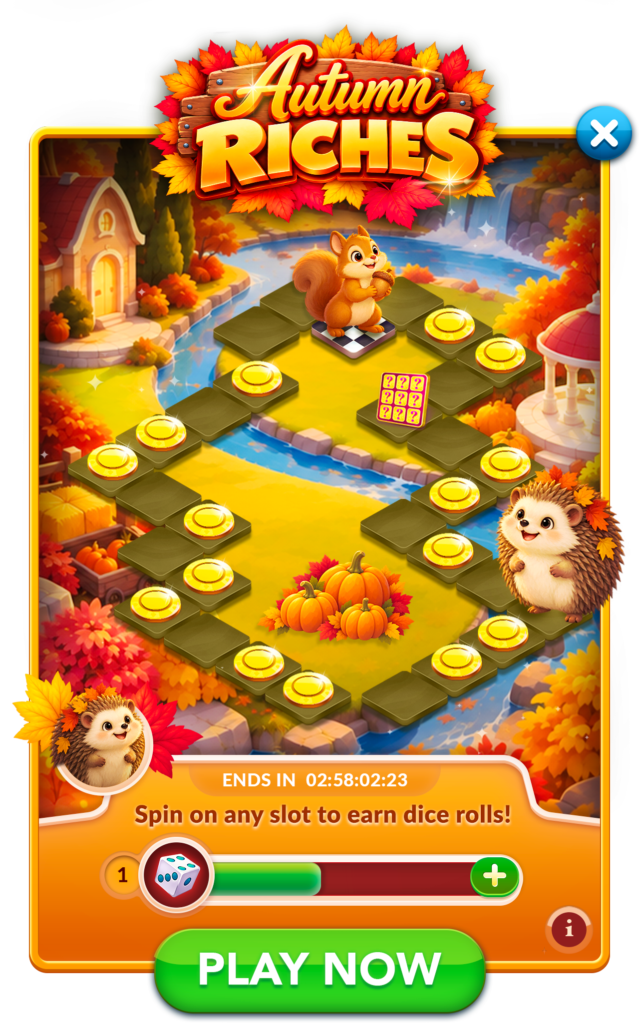
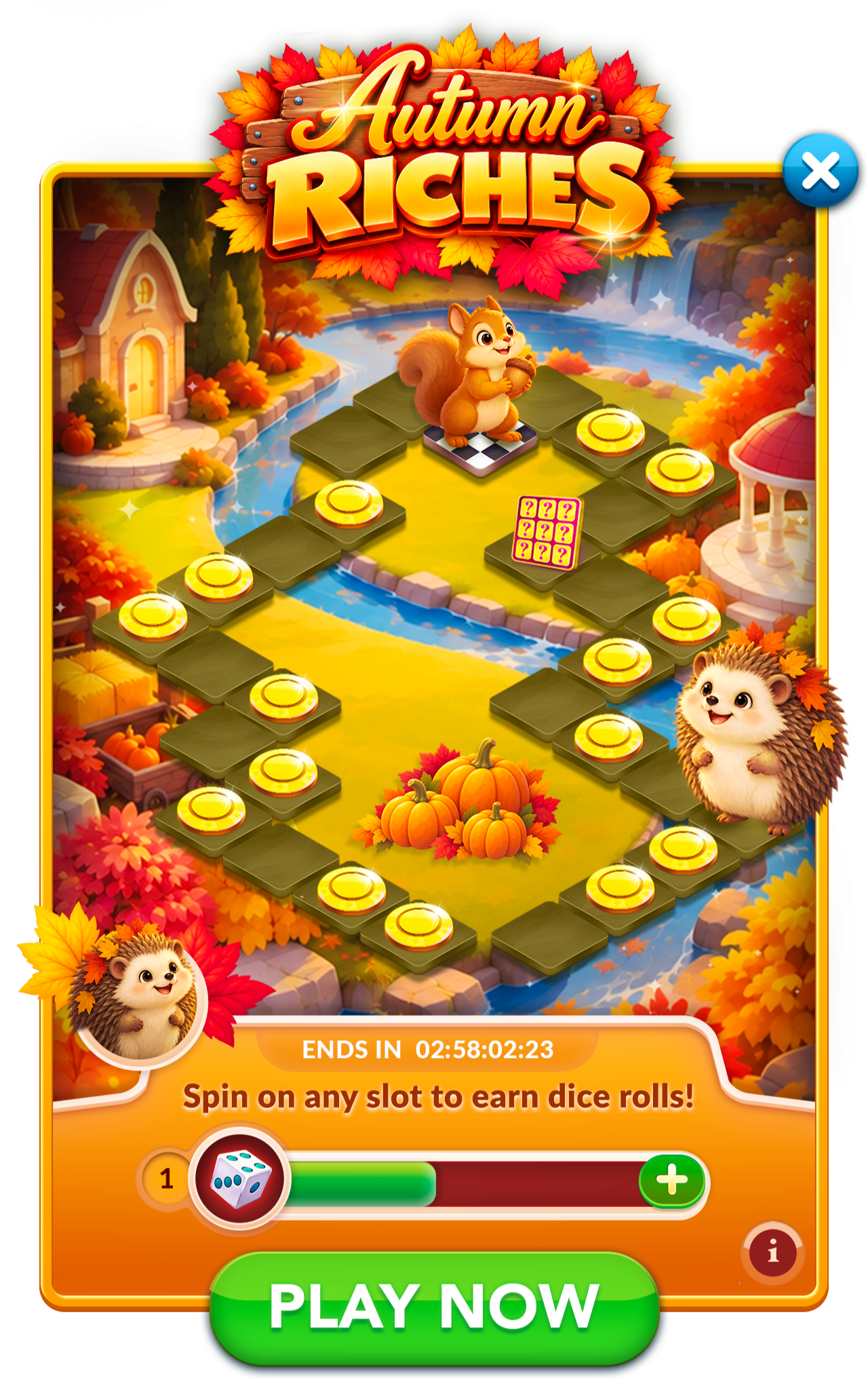
Using the supplied board game template, create a complete Fall-themed visual reskin while maintaining all established UX, layout, and safe-zone requirements.
Required content:
Campaign Logo
New Fall campaign name and visual identity.
Timer
Maintain established placement and readability.
Copy
“Spin on any slot to collect dice rolls!”
CTA
PLAY NOW!
Creative exploration can include: environment, board materials, seasonal props, landmarks, reward presentation, lighting, atmosphere, decorative elements, color palette, campaign branding and logo treatment.
ideation + Art direction
AI IN THE WORKFLOW
CAMPAIGN NAME
Using ChatGPT, I generated 20 potential names for a Fall-themed social casino campaign, exploring combinations of words like Riches, Bounty, Golden, and Fortune with seasonal themes like Fall, Autumn, and Harvest, while also using AI to surface new naming directions.
Fall Fortunes
Golden Harvest
Autumn Riches
Harvest of Fortune
Bountiful Riches
Golden Bounty
Autumn Fortune

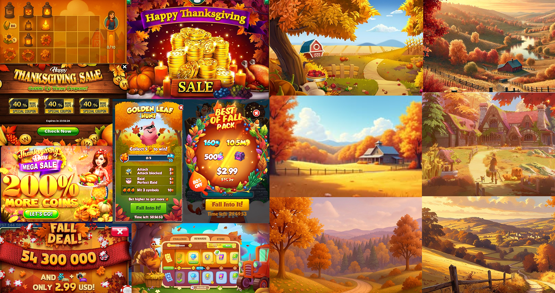
C. BACKGROUND - MOODBOARD
AI IN THE WORKFLOW
BACKGROUND
ChatGPT PROMPT:
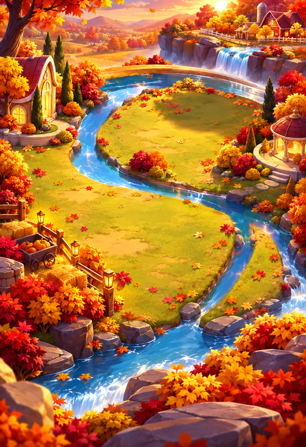
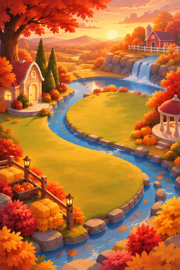
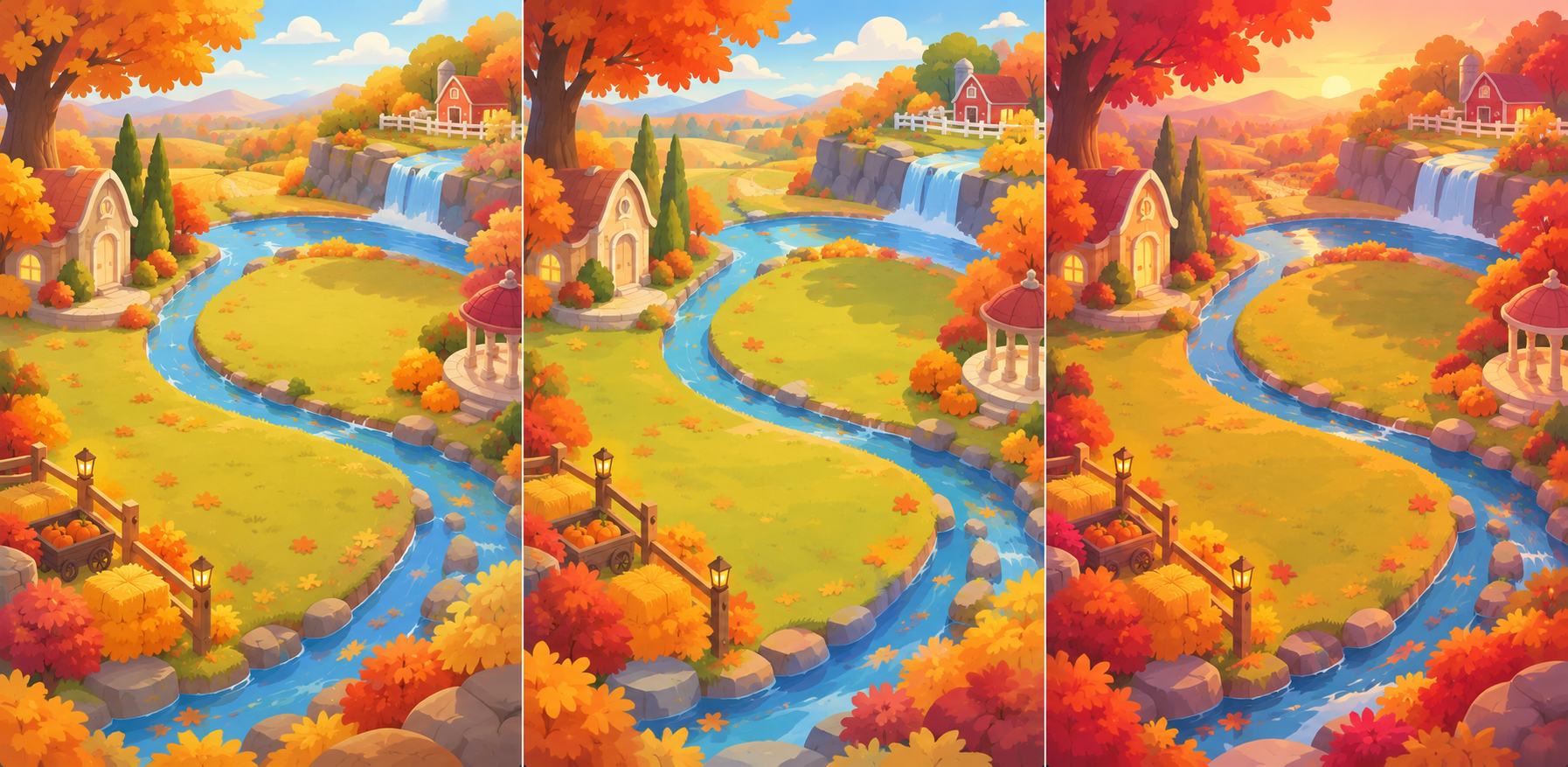
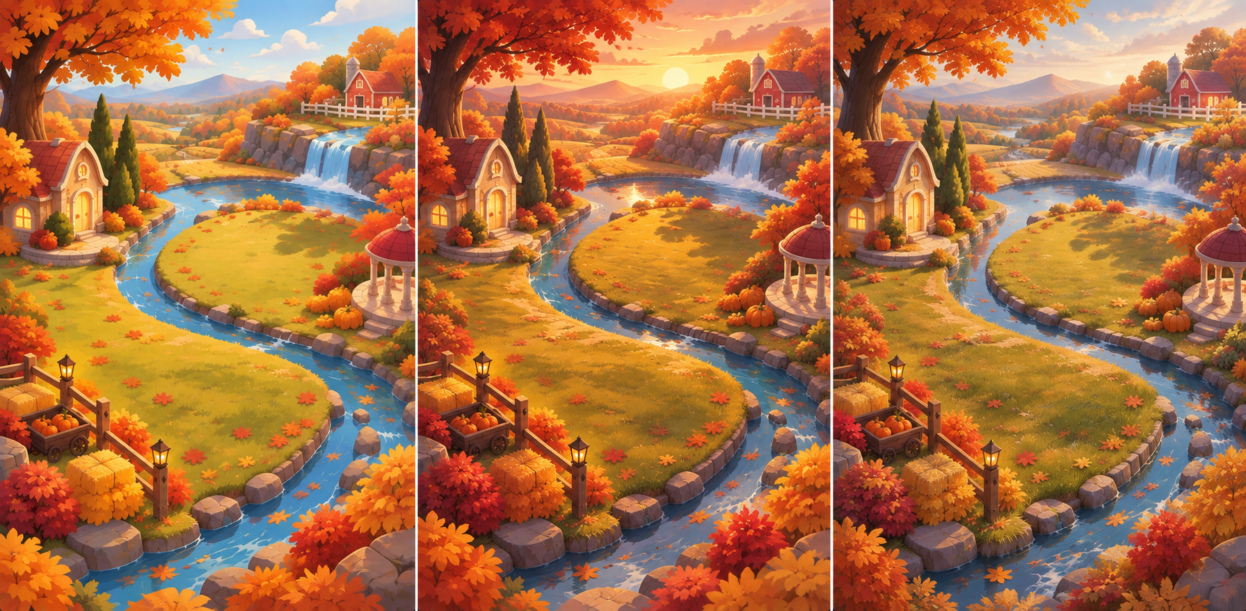
Using the provided images as structural and perspective references, create a new Fall-themed background environment for the Autumn Riches social casino board-game event.
This is an environment reskin, not a redesign of the game board.
The reference images show:
the background/environment without gameplay tiles
the exact placement and perspective of the board tiles
the final gameplay composition with rewards and UI
Use all three references to understand where gameplay elements will eventually sit.
STRUCTURE & PERSPECTIVE
Preserve the existing camera angle, perspective, depth, ground plane, and overall composition of the original environment.
The gameplay board follows a fixed elevated/isometric perspective. Design the landscape so the existing board tiles can be placed back over the environment without changing their position, scale, angle, or perspective.
Maintain the same general usable terrain and open areas underneath the board path. Environmental forms should follow the perspective and depth established by the existing board.
GAMEPLAY SAFE ZONES
Treat the entire board path, reward locations, center gameplay area, and bottom UI region as locked safe zones.
Do not place important landmarks, large props, high-contrast details, text, characters, or focal points underneath these areas.
The environment should visually frame the gameplay path rather than compete with it.
Concentrate richer environmental storytelling toward the outer perimeter, corners, and distant background, while keeping the central board area relatively clean and readable.
AUTUMN RICHES ART DIRECTION
Transform the futuristic environment into a warm, elevated Fall world consistent with the established Autumn Riches logo.
Use rich gold, amber, burnt orange, copper, burgundy, and deep red, balanced with darker tones for depth.
Incorporate elements such as autumn trees, golden foliage, fallen leaves, warm atmospheric lighting, subtle harvest details, and elegant hints of abundance and fortune.
Maintain a polished, dimensional social-casino game-art style: vibrant, aspirational, rewarding, slightly fantastical, and premium rather than realistic, rustic, or childish.
Use warm cinematic lighting, soft glow, dimensional highlights, and subtle sparkle to connect the environment visually to the Autumn Riches branding.
IMPORTANT CONSTRAINT
The board tiles, rewards, crowns, treasure chests, dice, gameplay UI, frame, and bottom interface shown in the references are placement references only.
Do not reproduce any of these elements in the generated image.
Generate only the clean Fall environment/background so the original gameplay board and UI can later be composited on top.
OUTPUT
Create a clean background plate at the exact same aspect ratio and composition as the supplied background reference, with no board tiles, rewards, UI, text, logos, buttons, or interface elements.
Path to Plenty
Bounty Trail
Golden Getaway
Autumn Adventure
Trail of Riches
Rollin' in Riches
B. LOGO CREATION - MOODBOARD
C. CHARACTERS & MOTIFS- MOODBOARD

DURATION
2 DAYS
SCOPE
CASE STUDY 5 MIN READ
AI SOFTWARE
ChatGPT, Figma Make, Firefly
Creative Brief
Fall LiveOps Campaign: Autumn Riches
PROJECT OVERVIEW
Using the provided LiveOps board game wireframe/template, create a seasonal Fall campaign for a social casino game.
The board game experience, UX, layout, dimensions, and safe zones have already been established. This is a creative reskin, not a redesign. The existing template defines where key gameplay and UI elements must live. The creative challenge is to develop a fresh seasonal concept and visual identity within those constraints, transforming the existing board into a cohesive Fall experience while maintaining usability and readability.
WHAT STAYS FIXED
The provided template establishes the production framework, including:
Board layout · UI placement · Safe zones · Gameplay path · Reward locations · CTA placement · Timer placement · Dimensions/aspect ratio
These elements should not be redesigned or repositioned.
The creative work should happen around and within this established framework.
CREATIVE DIRECTION
Fall meets Casino.
Use the existing wireframe/template to transform the board into a seasonal world that combines the warmth and abundance of Fall with the excitement and reward feeling of social casino.
The campaign should feel:
Playful, but not childlike · Aspirational · Rewarding · Premium · Energetic · Seasonal
Avoid simply decorating the existing board with generic Fall elements. The reskin should establish a recognizable creative concept through environment, color, lighting, materials, props, typography, and reward presentation.
Think:
Fall + Progression + Rewards + Casino Excitement
The final artwork should feel like the same game and same experience, transported into a new seasonal world.
CORE GAMEPLAY
Spin → Earn Dice → Roll → Progress → Earn Rewards
Players spin any slot to collect tokens and earn dice rolls. Dice are used to progress through the board and collect rewards. The mechanic does not change as part of the reskin. The creative treatment should instead reinforce the feeling of progression, discovery, and increasingly valuable rewards.
Harvest Riches
Fall Into Fortune
Fortune's Harvest
Golden Acres
Fields of Fortune
Roll Into Fall
Harvest Trail
AI IN THE WORKFLOW
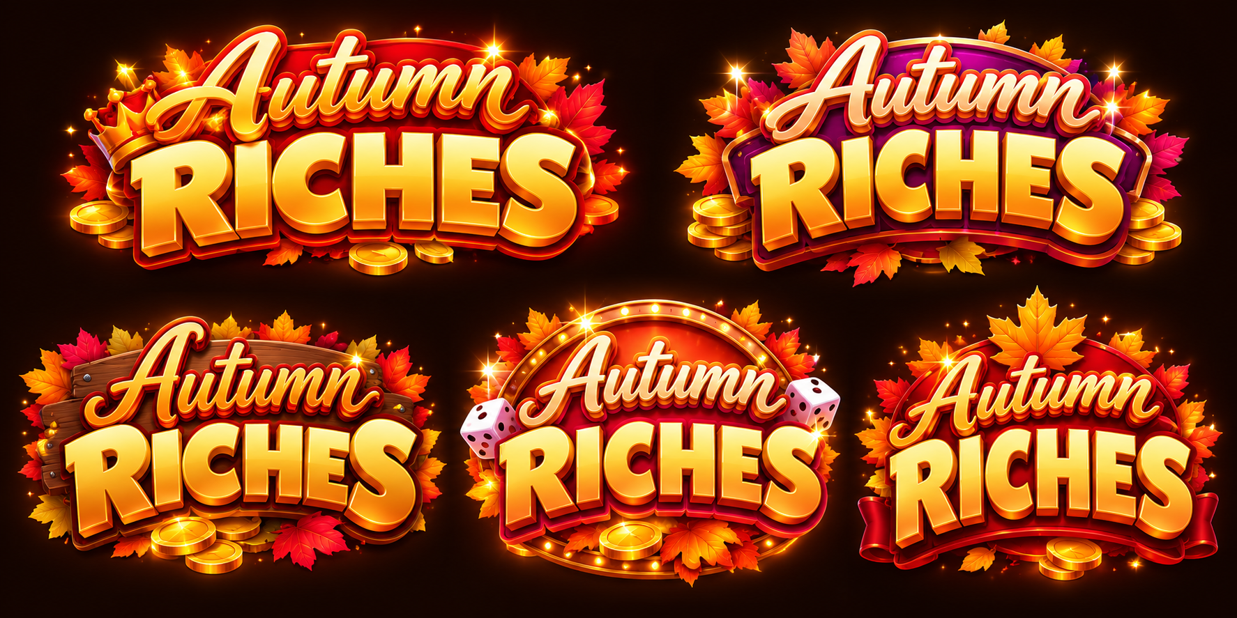
LOGO CREATION
ChatGPT PROMPT:
Using the provided reference image as the primary visual and stylistic guide, create a logo for “Autumn Riches” designed for a premium social casino game.
Typography & Hierarchy
“Autumn” should be secondary, with “RICHES” as the dominant focal point. Explore a combination of elegant script lettering and bold, dimensional sans-serif typography. The logo should remain highly legible at smaller in-game sizes.
Visual Direction
Capture the warmth and richness of fall while maintaining a sophisticated casino aesthetic. The result should feel mature, glamorous, aspirational, celebratory, and premium never childish, rustic, or cartoonish.
Color & Lighting
Use a rich autumn palette of gold, amber, warm orange, copper, and deep burgundy, with warm directional lighting. Incorporate metallic gold finishes, dimensional highlights, subtle glow, sparkle, and polished casino-style detailing.
Seasonal Motifs
Integrate autumn leaves and subtle seasonal elements into the logo as decorative accents. These should enhance the composition rather than overpower the typography.
Style
Premium social casino branding blended with elevated fall imagery. Dimensional typography, polished materials, dramatic lighting, subtle sparkle, and a strong reward/luxury feeling.
Avoid: childish styling, farmhouse/rustic aesthetics, flat typography, overly cute illustrations, excessive leaves, or generic Thanksgiving imagery.
Output: Create 5 distinct logo explorations that follow the same creative direction while varying typography, composition, framing, and use of seasonal motifs.
AI IN THE WORKFLOW
LOGO CREATION
Firefly – Gemini Prompt, Runway, OpenAI:
Using the reference image as a style guide, create 5 logo concepts for “Autumn Riches” for a premium social casino game.
Make “RICHES” the focal point, paired with a smaller elegant/script “Autumn.” Use bold dimensional typography, metallic gold, warm fall tones, dramatic lighting, glow, and subtle sparkle. Incorporate autumn leaves as supporting decorative elements.
The style should feel mature, glamorous, rewarding, and premium, blending Fall with casino excitement.
Avoid: childish or rustic styling, flat typography, excessive foliage, and generic Thanksgiving imagery.

AI IN THE WORKFLOW
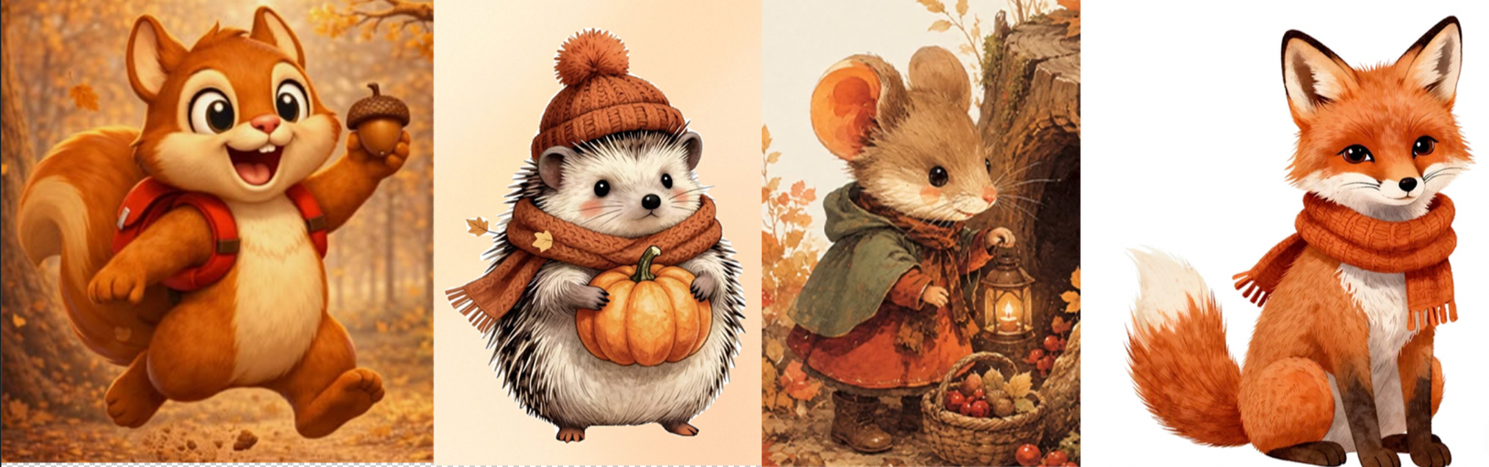
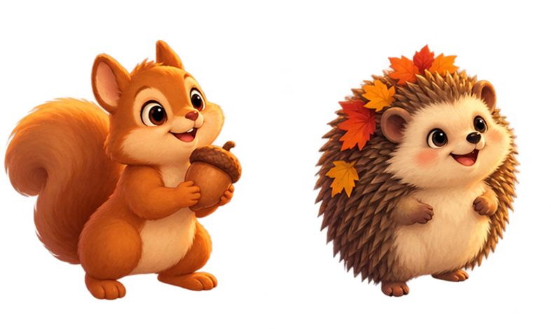
CHARACTER:
ChatGPT PROMPT:
Using the provided Autumn Riches environment/background as the primary and authoritative visual reference, create a set of characters designed to exist naturally inside this exact game world.
MATCH THE ESTABLISHED ART STYLE EXACTLY. The characters should look as though they were illustrated by the same artist, using the same rendering pipeline as the environment.
Character Concept:
Rendering Style:
Match the background’s soft, polished, painterly game-art rendering. Use simplified but believable forms, softly blended gradients, controlled painterly texture, gentle dimensional shading, rounded natural shapes, and clean silhouettes.
The rendering should sit between stylized illustration and realism: not highly realistic, but also not exaggerated, plastic, glossy, or overly cartoonish.
Avoid hard outlines and excessive micro-detail. Surface transitions should feel soft and painted, matching the treatment of the trees, buildings, pumpkins, foliage, rocks, and landscape in the reference.
Color & Lighting:
Match the exact warm autumn palette and lighting established by the environment: golden-orange sunlight, amber highlights, warm reds, muted burgundy, pumpkin orange, soft yellows, earthy browns, and restrained greens.
Light the character from the same direction and elevation as the environment reference, with warm directional sunlight, soft shadows, subtle ambient fill, and gentle rim lighting where appropriate. Avoid harsh studio lighting or dramatic lighting that does not belong in the scene.
Perspective & Camera:
This character will eventually be composited onto the existing board-game environment. Match the environment’s elevated three-quarter/isometric camera perspective. The viewer should see an appropriate amount of the character's top surfaces so the character feels grounded on the same plane as the board.
Feet and ground contact must follow the established perspective. Do not render the character from a straight-on eye-level viewpoint.
Gameplay Readability:
The character must remain recognizable when scaled down for a mobile game. Prioritize silhouette, pose, facial expression, and major color blocks over tiny details.
Consistency Rule:
Do not introduce a new rendering style. Do not make the character more detailed, glossy, saturated, realistic, or cartoonish than the supplied environment. The character and background must feel like assets from one cohesive game-art system.
Output:
Full-body character, entire silhouette visible, isolated on a transparent background, no environment, no scenery, no UI, no text, no logo, no decorative frame. Include a subtle natural contact shadow only if needed for grounding.




A. CAMPAIGN NAME
03
direction & Refinement
TRADITIONAL DESIGN WORKFLOW
AI output → Photoshop → Composition refinement → Typography → Lighting → Asset cleanup → Final Design
I brought the generated assets into the established event template, preserving the existing UI hierarchy and gameplay placement. In Photoshop, I refined composition, color, and lighting to align everything with the new visual direction. Paint-overs, lighting adjustments, and asset cleanup helped unify the individual elements so the final design felt cohesive and part of the same world.
NEW THEMES
TESTING ACROSS TOOLS AND THEMES
I tested Firefly, DaVinci, Nano Banana, and ChatGPT throughout this process. I found the most success with ChatGPT because I could provide more detailed prompts and creative direction. With some of the other tools, prompt-length limitations made it harder to communicate the full visual system, resulting in more iteration and inconsistent outputs.
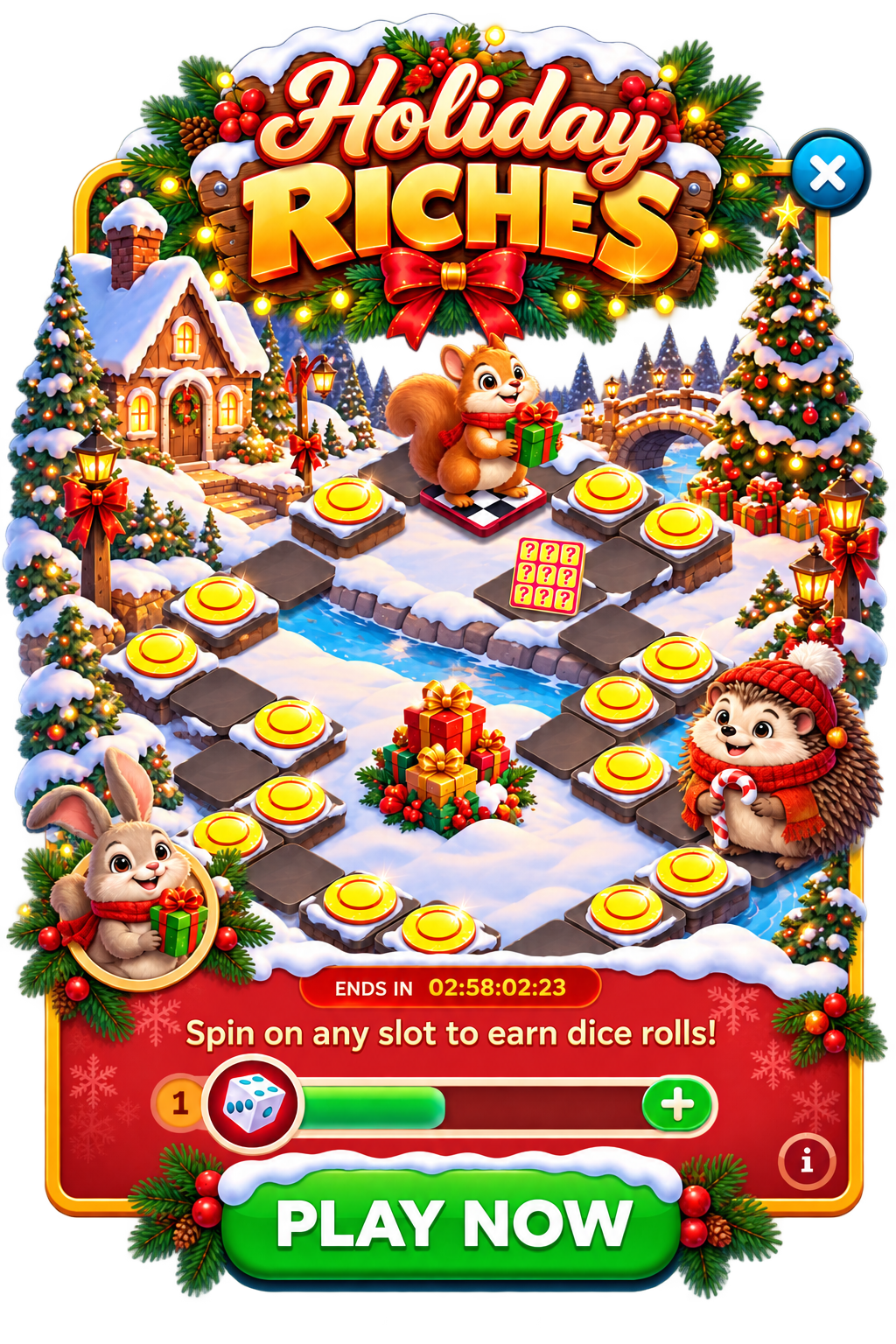
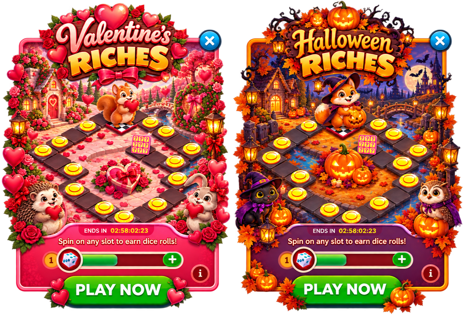
Once the style and master prompt were established, I tested how well the workflow could scale by asking ChatGPT to translate the concept into three new themes: Halloween, Christmas, and Valentine’s Day.
The results were useful for rapid ideation, but not final production. The screens became too busy, the softer rendering style was lost, and the level of detail and visual consistency varied across each theme.
This reinforced an important takeaway: even with a strong master prompt, generating an entire finished screen at once gives up too much creative control. The better workflow is still to generate and direct individual elements step by step, then bring them together through traditional design and art direction.
For me, AI was strongest here as a way to quickly explore what a new theme could become before committing to a final direction.
CONCLUSION
This exploration showed me that AI can dramatically accelerate asset creation, but strong art direction is still essential to getting production-ready results.
I rarely got what I needed on the first generation. The strongest results came from providing clear visual references, mood boards, detailed direction, and increasingly specific prompts. The more creative context I gave the tools, the more control I had over the output.
Consistency was another challenge. Generating a background, logo, characters, and supporting assets independently doesn’t automatically create a cohesive visual system. Establishing master prompts and shared style rules became critical for carrying the same rendering, palette, lighting, and perspective across every asset.
And generation was only part of the process. The assets still needed to be brought into the existing template and refined through composition, paint-overs, color correction, lighting, typography, and cleanup before they felt like one finished experience.
The biggest opportunity is speed at scale. Creating this first event required experimentation and iteration, but it also established a reusable visual language and prompting system. My next step is to test how quickly that system can translate into entirely new seasonal events while maintaining the same level of quality and cohesion.
AI accelerated the making. Art direction made it a system.